Adobe Illustrator

Simple shaded web buttons

This tutorial assumes a certain degree of familiarity with other memebers of the Adobe suite of applications. This tutorial will not spell out every single click or every button necessary to create the outcome image although it will guide the reader to the relevant controls and offer some help with their use.

Most images can be enlarged by clicking on them.

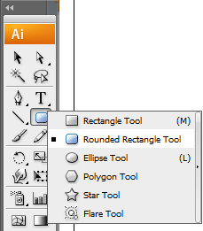
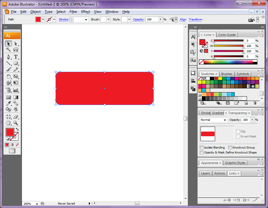
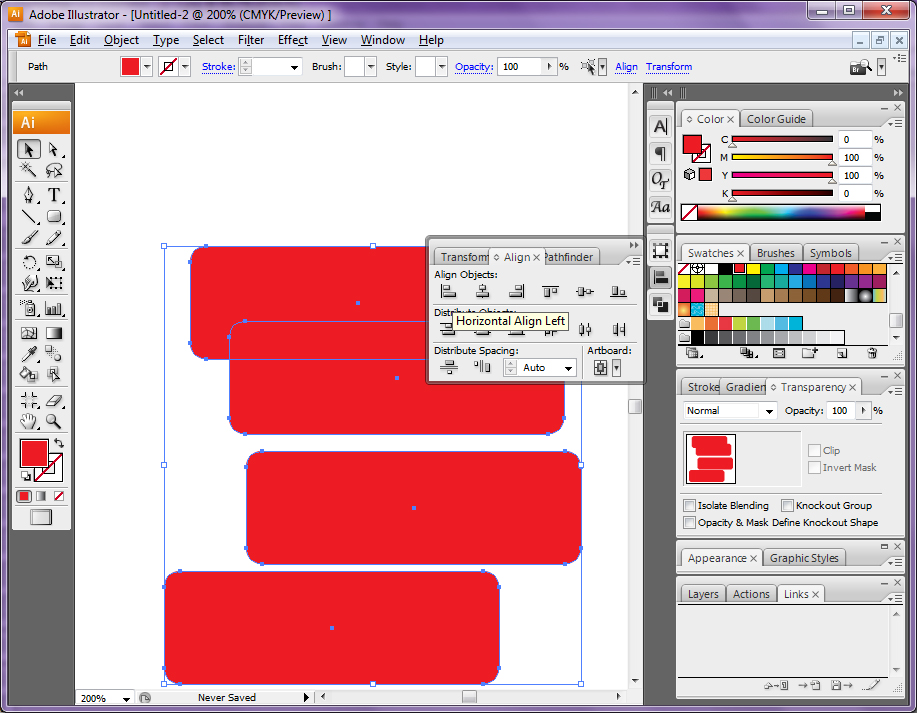
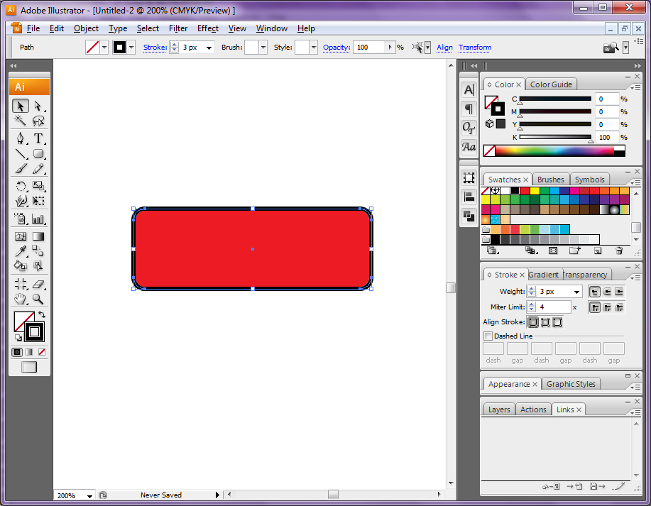
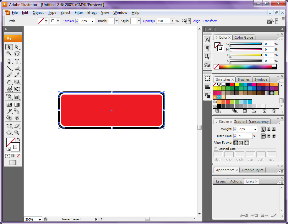
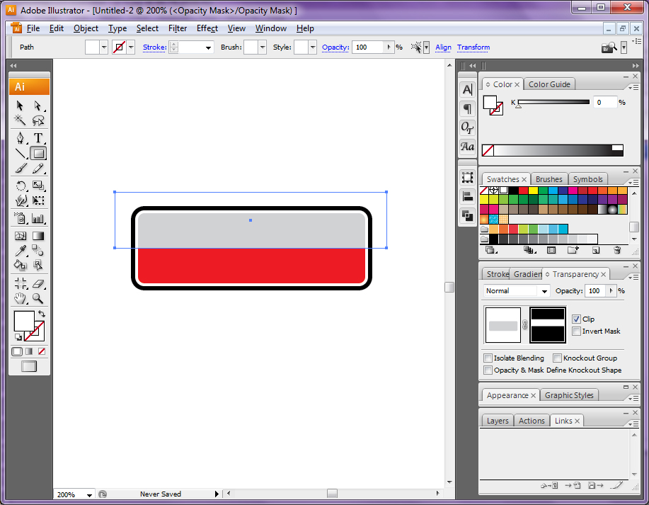
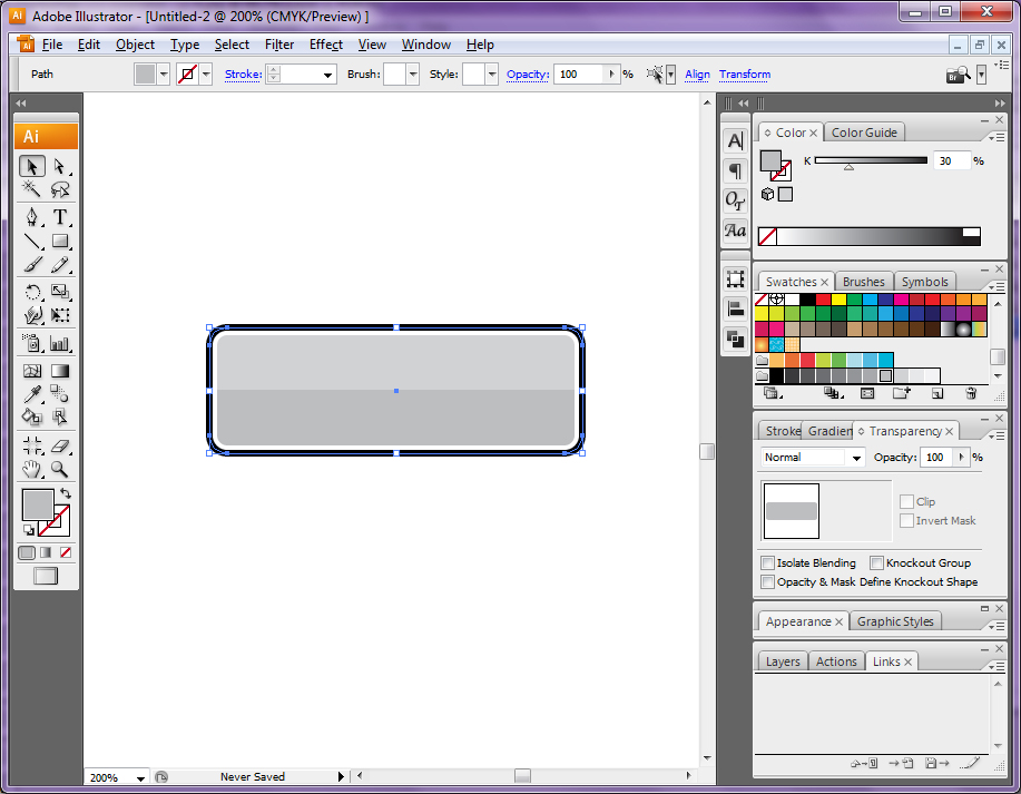
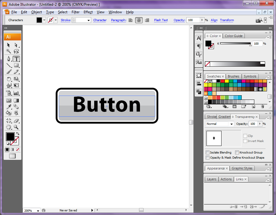
Here is the button design this tutorial works towards:

Completed button

1

  1. Open Adobe Illustrator
  2. Select Web Document
  3. Set the page orientation to landscape, leave the other settings at their default value
  4. Locate the Rounded rectange tool from the left hand tool bar (LHTB hereafter) as shown.
The Rounded Rectangle Tool

2

  1. With the Rounded rectange tool selected, click and drag over the artboard to draw a rounded rectangle.
  2. Using the Fill and Outline swatches toward the bottom of the LHTB, set the rectangle to have a solid fill colour and no outline.
  3. While the mouse-button is depressed the size of curve applied to the corners of the rectangle can be altered with the Up and Down arrow keys. Adjust the corners of the rectangle as desired and release the mouse button to draw the rectangle.
Draw a rounded rectangle.

3

  1. Copy and paste the rectangle using CTRL + C to copy and CTRL + V to paste three times to make four rounded rectangles in total.
  2. Using the Selection tool from the LHTB, select all four rectangles simultaneously by keeping the Shift key held down while clicking each rectangle in turn.
  3. Locate and open the Align panel. This panel is not usually displayed by default but can be found in the topmost menu bar in the Window menu.
  4. Use the Horizontal align center and Vertical align center tools in this panel to move all four rectangles together giving the impression of only one being present. This arranges the four rectangles one behind the other.
Copy and paste the rectangle 3 times to make four in total.

4

  1. Deselect the four rectangles and then reselect the topmost of the four.
  2. Using the Fill and Outline swatches towards the bottom of the LHTB set this top rectangle to have no fill, with the Outline swatch uppermost, locate the Swatches panel usually found in the right hand panel bar or (RHPB hereafter) and select black.
  3. Locate the Stroke panel, usually found in the RHPB and set the stroke weight to 3px as shown.
  4. Lock this rectangle from further edit by pressing CTRL + 2.
Apply the outer border.

5

  1. Select the next topmost of the three remaining rectangles.
  2. Repeat the actions of stage four, this time make the stroke weight 7px and the outline colour white.
  3. Lock this rectangle from further edit by pressing CTRL + 2.
Apply the inner border.

6

  1. Select the next topmost of the two remaining rectangles.
  2. Identify two colours which will form the main background colours of the button. These can either come from or be added to the Swatches panel from the RHPB. These colours will work best if one is slightly lighter than the other and if they are shades of the same colour. For example, this tutorial uses 20% grey and 30% grey.
  3. Using the Fill swatch from the LHTB and the Swatches panel from the RHPB, set the fill colour of this rectangle to the lighter of the two selected shades.
  4. Locate the Transparency panel from the RHPB. Open the Panel options menu, found as a small icon in the top right of each of these panels, and select Make opacity mask.
  5. Two thumbnail panels should be visible in the Transparency panel as shown. Select the rightmost of these. Select the white fill swatch using the Swatches panel from the RHPB and the Fill swatch from the LHTB. Draw a rectangle as shown over the original rectangle using the Rectangle tool from the LHTB. Finally, click on the left hand panel of the two thumbnail panels in the Transparency panel.
  6. Lock this rectangle from further edit by pressing CTRL + 2.
Apply the top fill colour

7

  1. Select the next last rectangle.
  2. Using the Fill swatch from the LHTB and the Swatches panel from the RHPB, set the fill colour of this rectangle to the darker of the two selected colours from stage 6.
  3. Lock this rectangle from further edit by pressing CTRL + 2.
Apply the lower fill colour

8

  1. Using the Text tool from the LHTB, create a text rectangle which is roughly the same size as the background rectangles as shown.
  2. Add in the desired text. Style the text by selecting the desired values in the Character panel which is not always displayed by default but can be found in the topmost menu under Window, Type, Character.
  3. Set the text alignment to Align center using the Paragraph panel which is usually found grouped with the Character panel.
Add some text

9

  1. Unlock all the created elements by pressing CTRL + ALT + 2.
  2. Save the design. The button can be made website ready in three ways from this point.
  3. 1: Export the graphic directly from Illustrator.
  4. 2: Open the created .ai file in Photoshop and export from there.
  5. 3: Using CTRL + A to select all, copy all the element of the button using CTRL + C, open Photoshop and create a new document with CTRL + N then paste the button graphic in with CTRL + V. Select the Smart object option.
The final button design